There are many steps one needs to take before starting to remodel a bathroom and when the bathroom is the master bath, it makes it even more important, especially if you eventually want to sell your house.
My husband suggested (which I hadn’t even considered) to go to open houses and look at what new materials are being used. So, last weekend, we headed to the 2013 Parade of homes. The houses we looked at were all new and ranged in price from $375K to $735K.
When we entered the first house, we recognized the builder as he was one we considered buying a house from a couple of years ago when we were in the market for a new house. He didn’t recognize us though. The style of house was pretty much the same as what he has built in the past so I didn’t expect to see too many new options.
We walked through the house and eventually came upon the master bathroom. Sure enough, the bathroom fixtures and tile were pretty similar to the ones we had seen in the past.
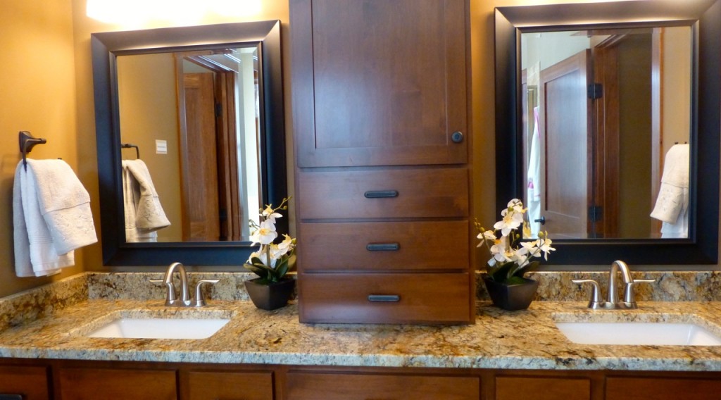
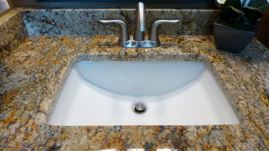
I have never liked the middle cabinet that builders install between the sinks, have you? The shape of the sink and the granite countertop looked nice although the granite might be a tad too dark for me.
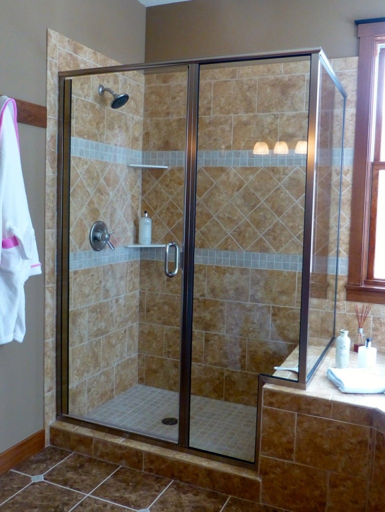
The shower stall was tiled which is nice but the tile the builder used was too common. Nothing unique here. Oh — but wait. What’s that to the left of the shower stall?
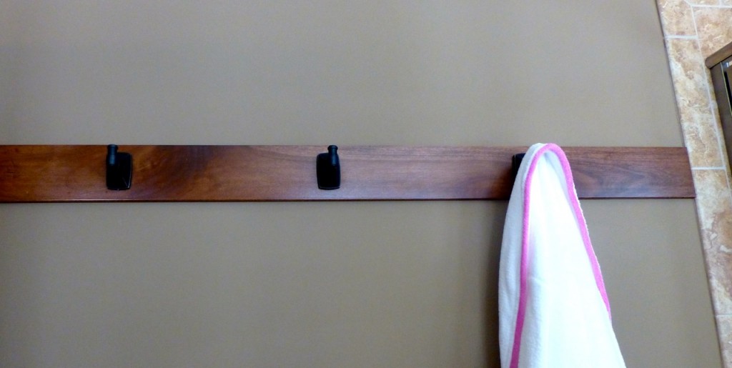
This looks interesting. I had never seen robe hooks that were installed on a piece of wood. Normally people install the hooks on the wall or behind a door but this gives the hooks and the wall a nice clean look.
The placement of the corner tub looks pretty similar to ours. I wish that the fixtures were someplace else though. It makes it hard to get in and out of the tub unless you’re really tall. Any thoughts on why builders don’t give this more consideration?
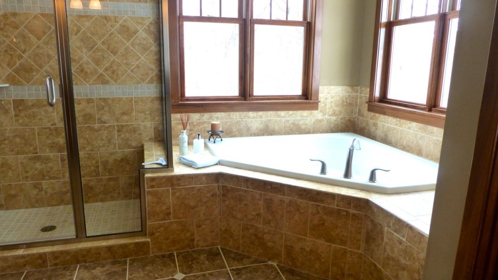
As I was exiting the bathroom, I noticed a sign that said “NO PHOTOGRAPHY.” Oops! Oh well, I won’t mention the builder (his loss) since he doesn’t want people to see what he’s done. Or, perhaps he doesn’t want anyone to steal his design ideas?
Onward to the next house!
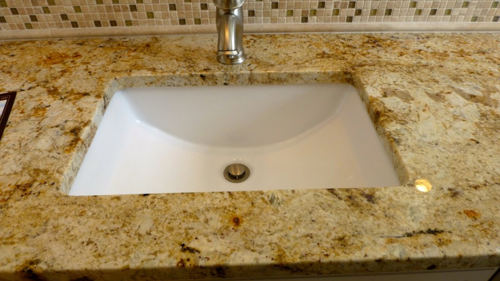
Looks like granite is still being used in a lot of master bathrooms. This one has a one handle fixture and different tiles as a backsplash instead of matching granite. I’m not sure it “flows” right but I do like the sink and the granite countertop isn’t too bad.
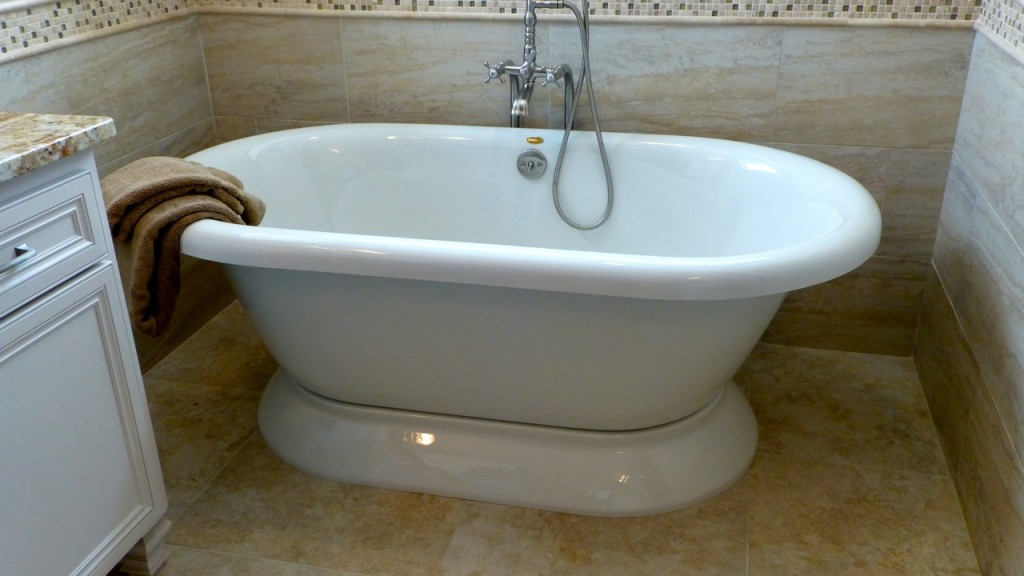
In this house, they used an old fashioned looking tub. The inside of the tub seems small though and doesn’t lend itself to “lounging” in the tub. Hmm … lounging in the tub … I don’t think I’ve heard anyone call it that before. (laughing) The one thing I DO like about this arrangement is that they have the fixtures in the back so you don’t have to maneuver around them when you get in the tub. Notice the tile around the tub itself? It’s rectangular and I think looks very pretty.
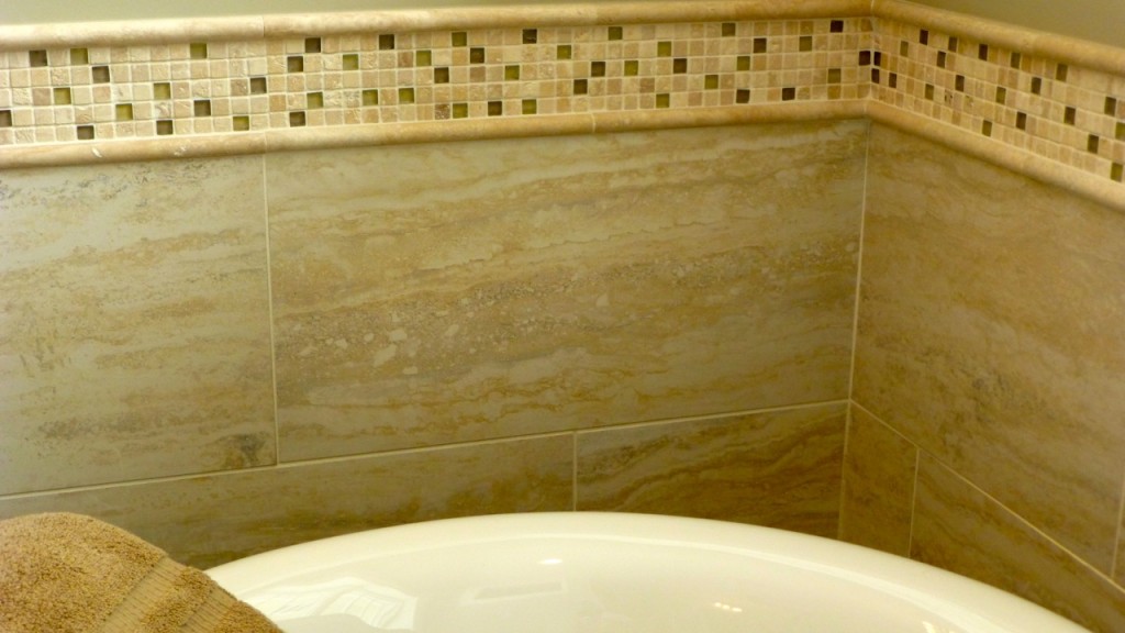
Here’s a closer view of the large tile around the tub. Yes, I do like these tiles.
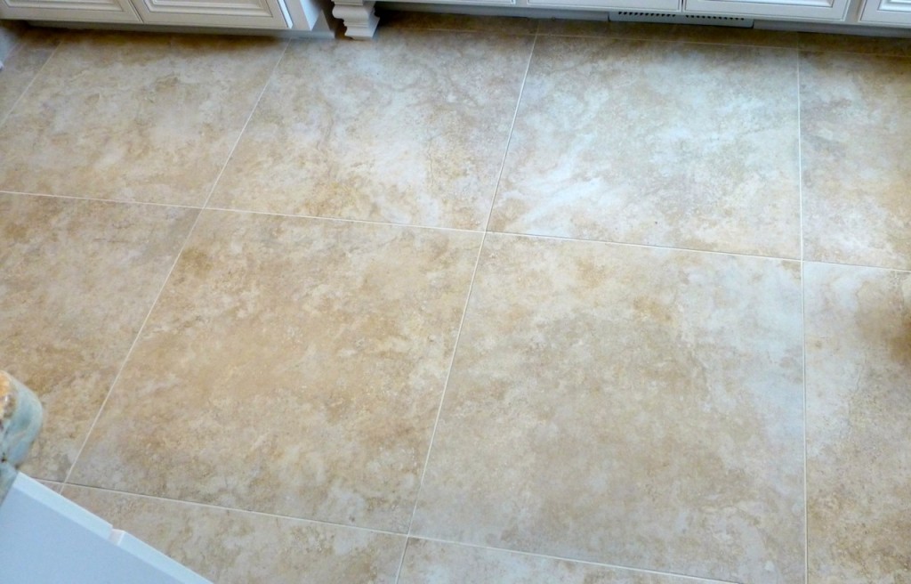
The floor tile matches the rectangular wall tall but it’s shaped differently. The large tile on the floor looked really nice and gave the room an airy feeling.
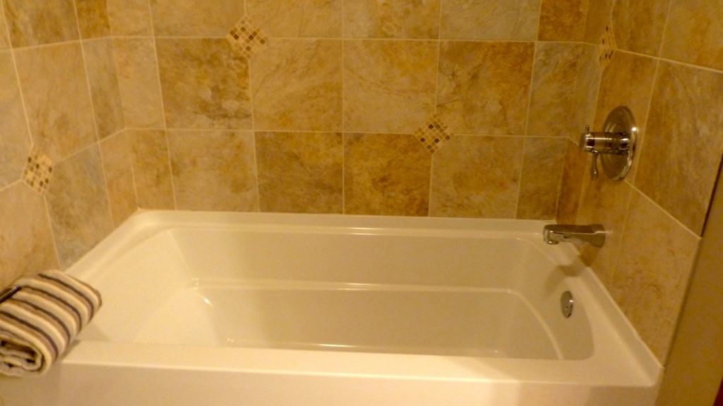
The guest bathroom tub looked too small for soaking in and the tile, again, was “common.” Nothing special.
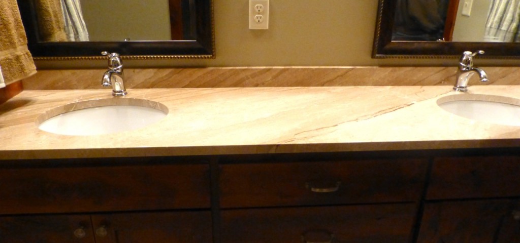
Onward to the next house! The countertop in this house looked like it was marble but I don’t believe it was.
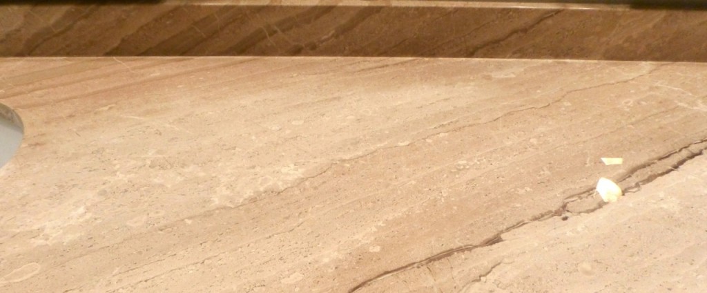
Here’s a closer look … Can you tell if it’s granite or marble? It had a very soft feel to it.
The rest of this bathroom wasn’t very exciting so that was it for this house.
Onward to the next house! Â The house we looked at next was a LOT less expensive so they used cheaper materials. I am not sure what this next countertop was made out of — formica? Â It was plain white and they matched the mirror frames to it to help it “flow” but it just wasn’t very appealing to me.
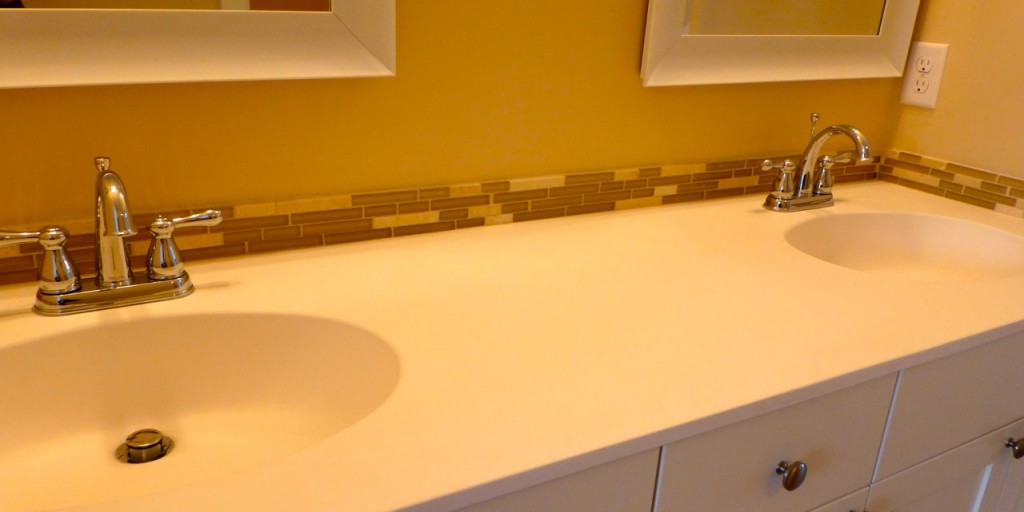
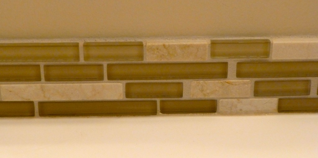
They also added tile for the backsplash, perhaps to give it some pizazz? It didn’t work for me though. I did like the backsplash though.
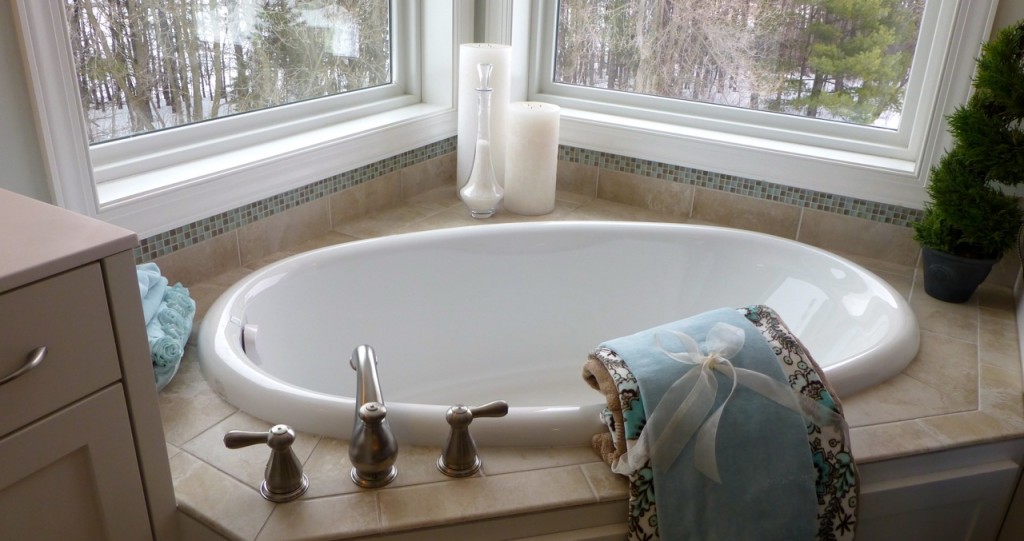
This next house had an interesting feature that I really liked – a round corner tub which I found very appealing. The layout of this area is exactly like my bathroom with two windows on each side of the wall. I think the tile could use a little “umph” — (you know, pizazz)Â (laughing) — but overall I liked the arrangement. Â And did you notice that the fixtures aren’t in the way of your getting into the tub? Â Nice Mr. Builder!
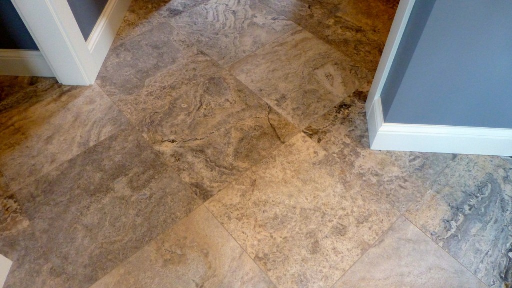
Onward to the next house which also had some nice features that I would consider. First, the floor tile was nice and I liked that it was laid at an angle instead of straight. And look at the beautiful blue color on the wall! Ooh la la!
Next, I liked the granite countertop. It looks kind’ve old fashioned but I think I could work with it.
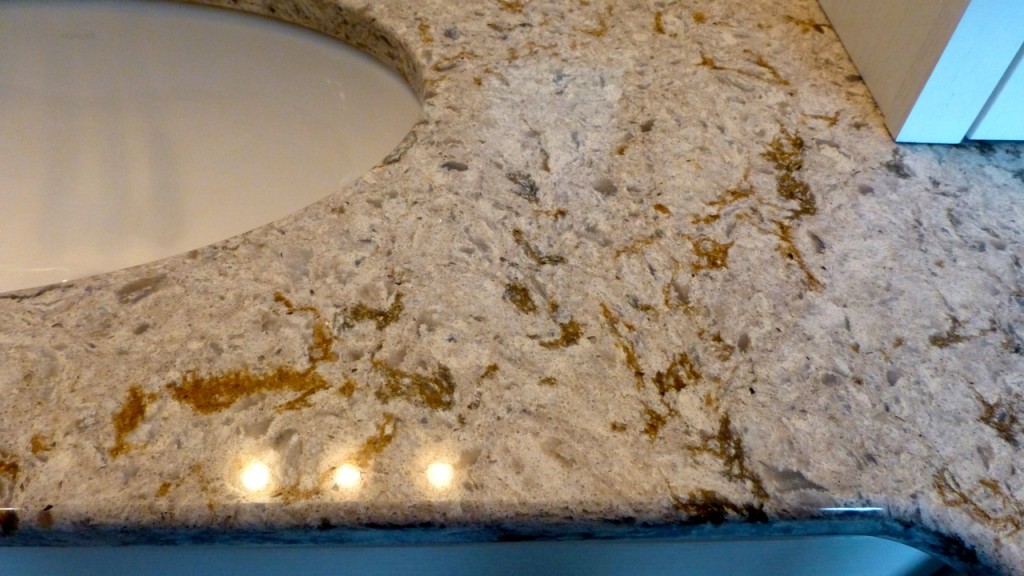
Lastly, the shower stall was quite different from anything I’d seen so far. Â (The tub wasn’t quite as exciting though). I like the way the shower has a glass divider and you walk “around the divider” to take your shower.
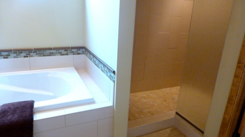
Here’s a closer view. Granted, the tile is a little bland but that’s something that can be taken care of pretty quickly. I like simplicity but not blandness.
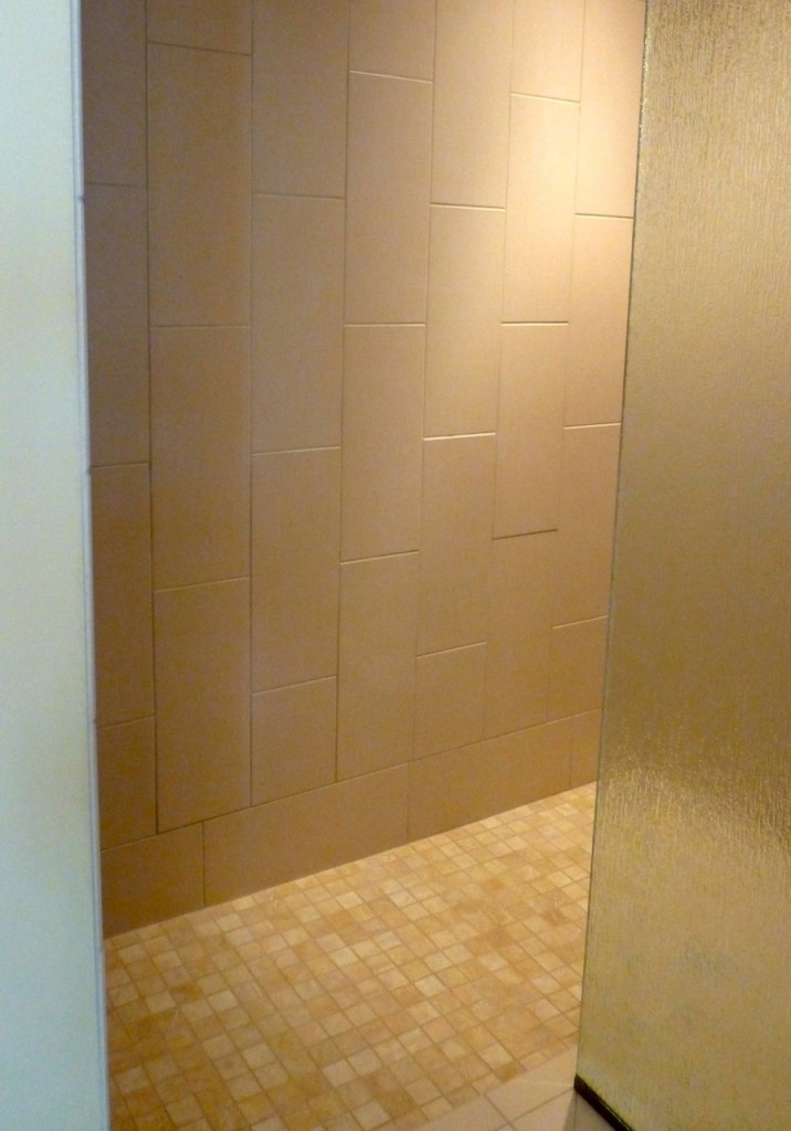
And that was it for our new house tour. Is there one particular countertop, tub or shower stall you liked?
Our next step is to look at Bathroom Magazines. After that we should have a fairly good idea of what we want.


You should have taken home your Bathroom books from my house when you were here for my birthday!
Yes I should have. Maybe they’ll have something new though since it’s been 3 years or so since that remodel.